
Classication
Pupil's information monitor
UX Design for Communication Application
Project Overview
As parents, we are responsible for our child's daily activities, especially in school.
The communication between the teacher/school and the parent is done via multiple channels. Printed information pages, emails, apps, chat apps, and more. And it is the parent’s responsibility to track it all and make sure the kid isn’t missing anything or performing well in school. Furthermore, the communication with the teacher is done through multiple channels and usually out of context.
CLASSICATION is an app that brings it all into one app that helps the parent stay updated on what is going on with their children in school and stay on top of the curriculum and the communication with the teacher.
My Role In This Project

The Problem
Organization of information - menu complexity, information overload, and disorder that create confusion and difficulty updating important messages.
Information availability - it's hard to filter and evaluate what's relevant for tomorrow.
Monitoring a child's learning process - Information about tests, grades, assignments, behavior, and comments is not compiled in one place.
Research
In my research, my goal was to identify parents’ needs and understand their struggles as well as what they currently do to communicate with the school.
Competitor Research
My first step was to research the competitors to identify what they do well and what i can learn from them.
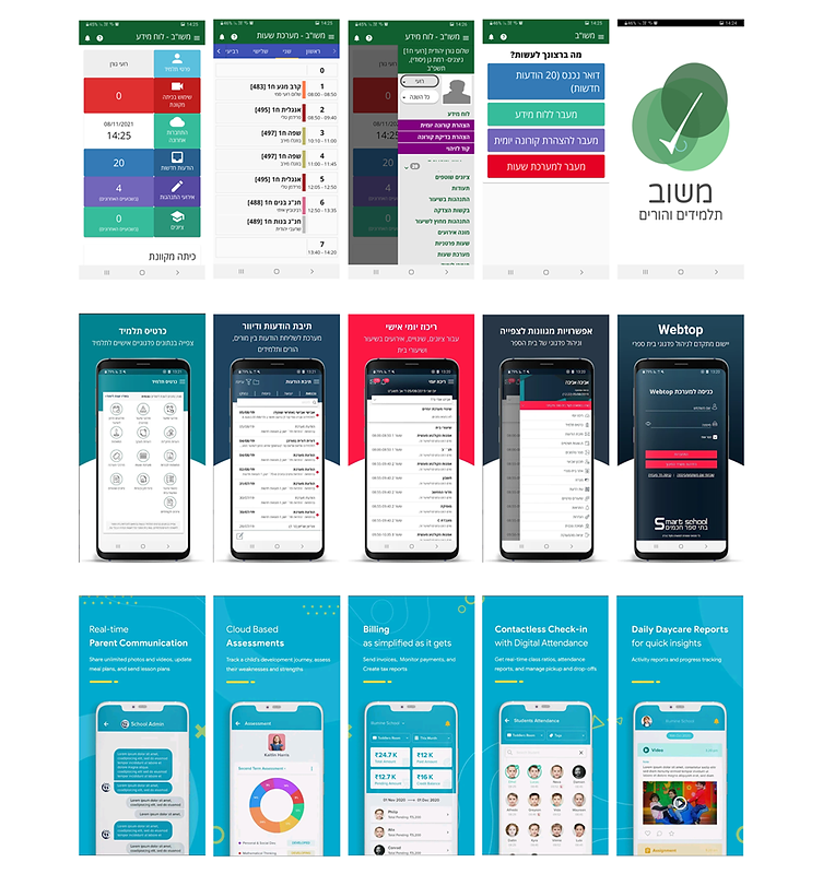
Communication Apps
Are apps that combine many solutions for managing student information.
Pros:
-
Supports many needed features for parents such as Scores, events, curriculum, etc.
-
Push Notifications.
-
Information on class deductions and delays in
real-time.
Cons:
-
No overview page, you need to go through various menus to reach the information you need.
-
It is difficult to track information if you have more than one child
User Research
A survey was administered to twenty parents to find out how they communicate with teachers, to identify their needs, pain points, and what works best for them. The next step was to interview them.
With questions such as:
-
How they stay updated about school events?
-
Which apps they use and which is most comfortable to use?
-
How frequently they check the app?
-
Tell me about a difficulty or challenge you have today in communicating with the teacher / school
I learned from the interviews that:
-
The abundance of communication channels is confusing and makes it hard to follow.
-
The contact with the school is usually made with the class teacher, there is no direct communication with the professional teachers.
-
There is no one place that centralizes the latest information for tomorrow, one should look for the information among all the messages.
-
Using the app, just not friendly, very slow and outdated, contacting teachers, test boards, updates, etc
User (Proto Persona)
Udi Cohen, 48
Divorced,
Project Manager
Motivation
Udi needs to keep track of his kids' weekly schedules Prepare for exams and complete homework, and communicate with the teacher and professional teachers for clarification.
Getting ready for upcoming events is essential.
Pain Points
Since the kids are only with him part of the week, Udi must be familiar with all school guidelines and prepare things ahead of time.
There are lots of messages from the school and teachers, in various media, and with his children, he sometimes gets lost in all the information.
Since Udi is not always with his children, he wants to feel involved in their lives, and he wants to help them achieve their educational goals.

Wireframes
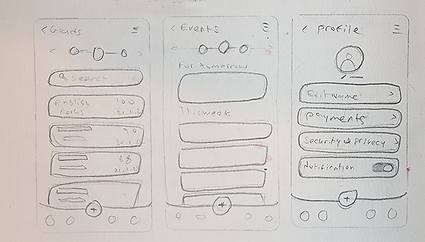
Once I had a clear understanding of the architecture, I moved on to the user interface. My favorite method is to start with a low-fidelity sketch to figure out what works and what doesn't, and then jump to Axure/Figma to create a more thorough and accurate prototype.

The Solution
Create a dashboard that combines the information into categories and creates order and organization. In each child's display, parents can see grades, notes, hours, and behavior information that allows parents to keep track of their children.
Major Screens
Main Page - Dashboard
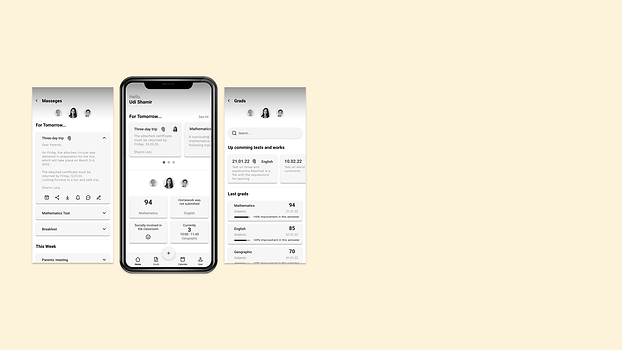
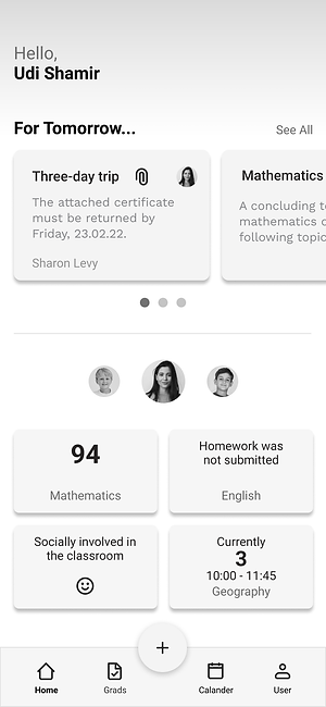
This is the main page, where basic information can be seen quickly. We can see on the screen the essential information for tomorrow for all children in the upper section, In the lower section, you will find information related to Events, Performances, Exam Grades, and current lessons for each child individually. we can change easily the information from one child to another.
Messages Page
This page brings together all messages for all three children in one place. It creates order and organization, which helps parents and kids prepare ahead of time.
There are various actions available within each message, such as chatting with the teacher, adding the event to the calendar, sharing it with another person, downloading documents, receiving notification before the event, and signing digitally for permission.

Tasks and achievements
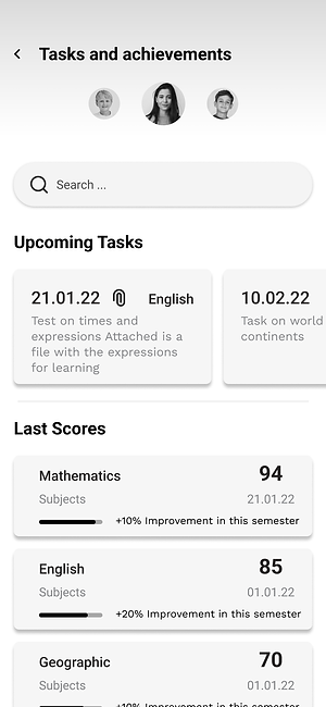
You can find information about upcoming tasks and last scores on this page, and you can easily change the information for each child individually.
Additional screens

